
Excel Charts
Change Axis to Logarithmic Scale in Excel (Horizontal and Vertical)
A step-by-step guide to change axis to logarithmic scale in Excel for better data visualization of exponential data.
Read article

1285 articles
A step-by-step guide to change axis to logarithmic scale in Excel for better data visualization of exponential data.

Learn how to change axis scale in Excel with a step-by-step guide to adjust bounds, enhance clarity, and highlight key trends in your charts.
Learn how to calculate trend percentage in Excel. Track growth, compare values to a base, and analyze trends with step-by-step instructions.
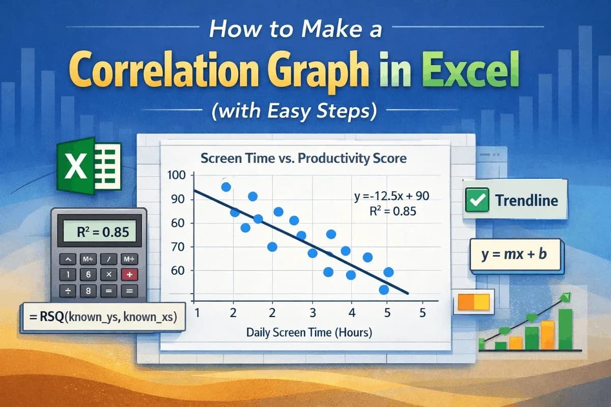
This article explores correlation graph and how to make correlation graph in Excel including adding regression line and calculating R square.
Master how to calculate trend analysis in Excel with charts, TREND & FORECAST functions. Easy steps to predict future data trends.
Learn how to find the slope of a trendline in Excel using charts, the SLOPE function, or manual calculation.

Learn how to delete every other row in Google Sheets using FILTER function, helper column, AppScript code, or by removing every Nth row.

Learn how to add and customize a trendline in Google Sheets with simple steps: create a chart, add a trendline, and change its type.

Learn how to extend a trendline in Excel using forward/backward forecasting or the trendline equation, with tips for accurate extension.

Learn how to remove rows with identical transactions in Excel using built-in tools, IF-COUNTIF and by copying unique data.

Learn how to find an unknown value in an Excel graph using trendline equations. Step-by-step guide for accurate predictions.

This article explores the correlation matrix and how to make a correlation matrix in Excel using Data Analysis ToolPak and functions.